
JGU Mainz – Q+ Study Programme
Q+: The Plus That Changes Everything
Brand strategy and campaign development for JGU Mainz's interdisciplinary Q+ study programme
How do you position a study programme that deliberately breaks with academic conventions? That was the challenge facing JGU Mainz with its interdisciplinary Q+ offering. We developed a distinctive visual identity that pairs a memorable symbol with playful wordplay – as versatile and adaptable as the programme itself: sometimes a source of inspiration, sometimes a networking hub, always a promise of more.
The Challenge
Academic Innovation Needs Strong Communication
German universities are often dominated by rigid curricula and disciplinary boundaries. With its Q+ study programme, Johannes Gutenberg University Mainz wanted to take a different path: a flexible add-on offering for students from any department who want to think outside the box. But how do you communicate a programme that deliberately breaks with convention? How do you make “interdisciplinary thinking” tangible? These questions stood at the start of our collaboration.
Deliverables
What We Delivered
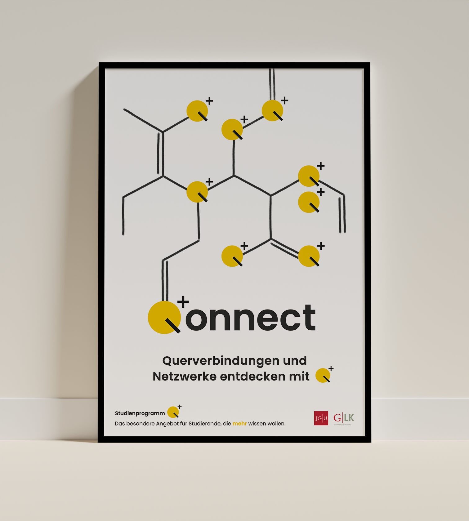
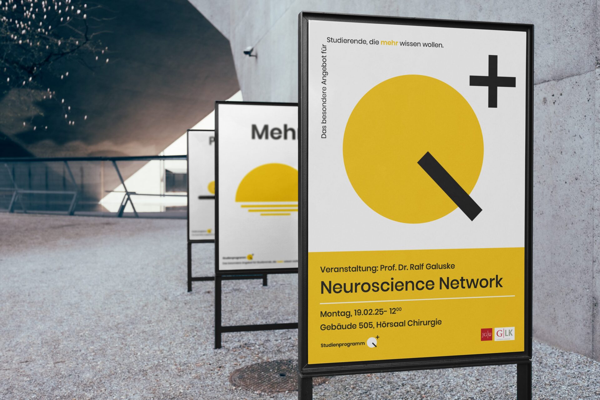
At the heart of our brand development for Q+ is an exceptionally adaptable visual symbol: a bold yellow circle cut through by a black diagonal – together forming an abstracted “Q” with a superscript “+”. Complemented by minimalist line drawings and pointed wordplay such as “Pflicht+Kür” (roughly, “required plus bonus”), this became a visual language that makes complex academic concepts accessible.
1
Brand Identity & Strategy
Development of a holistic brand concept (including naming) that reflects the values and goals of the Q+ programme and can be adapted across different communication channels.
2
Visual Identity
Design of a minimalist, flexible design system with the Q+ symbol as its defining element, complemented by clear typography and pared-back illustrations.
3
Communication Strategy
Development of audience-appropriate messaging with punchy coinages and a tone that combines academic seriousness with playful curiosity.
4
Campaign Development
Concept and execution of a poster series that visualises different aspects of the programme (networking, inspiration, expanding expertise) and is present at relevant touchpoints.
